![]()
In the world of luxury retail, the difference between a ₹5,000 product and a ₹5,00,000 product often comes down to one thing: The Light.
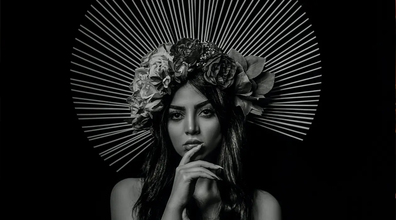
For high-end jewelry and horology (watches), flat, bright lighting is the enemy of desire. It strips away the mystery, flattens the texture, and kills the “soul” of the craftsmanship. At Amethist Media, we specialize in the “Dark & Moody” aesthetic—a technique rooted in the classical art of Chiaroscuro—to ensure your products don’t just look expensive, they look legendary.
Here is how we use light to define luxury at our NSP studio.
1. The Power of the “Hidden” (Shadow as a Tool)
Luxury is often defined by what you don’t see. By using a dark, low-key background, we allow the product to emerge from the shadows. This creates a sense of drama and exclusivity. In our studio at Vardhman Corporate Plaza, we use “negative fill” (black flags) to block light from certain angles, carving out the shape of a diamond or the curve of a watch case.
When you see a gold watch shimmering against a deep charcoal background, your brain perceives it as a “treasure” discovered in the dark, rather than just an item on a shelf.
2. Controlling Specular Highlights
Jewelry and watches are essentially a collection of tiny mirrors. If you hit them with a large, flat light, you get “hot spots” (ugly white blobs) that hide the detail.
- For Jewelry: We use pinpoint light sources to trigger the “fire” inside a diamond, creating those sharp, colorful flashes (refractions) that signify high-grade stones.
- For Watches: We use custom-made “diffusion gradients.” This creates a smooth, silky transition of light across the polished steel or gold, highlighting the “brushed” texture of the dial and the sharp edges of the hands.
3. Texture and “Macro” Mastery
Luxury is in the micro-details—the hand-stitched leather of a strap, the laser-etched logo on a crown, or the intricate prongs holding a gemstone. Our “Dark & Moody” setup uses a “rim light” (a thin sliver of light from the back) to separate the product from the background. This emphasizes the texture and makes the item feel three-dimensional, as if it’s jumping off the screen.
4. Color Grading for Elegance
Post-production at Amethist Media is where the “Amethyst” touch happens. We desaturate the backgrounds and enhance the warmth of the golds and the coolness of the silvers. By keeping the color palette restricted and moody, the focus remains 100% on the product’s brilliance.
5. Why Delhi’s Elite Brands Choose the Moody Aesthetic
In a crowded market like North West Delhi, every brand is shouting. Bright, white-background catalog shots are common. To stand out, you need a Visual Narrative.
- A “Dark & Moody” shot isn’t just a product photo; it’s an Editorial Campaign.
- It tells the customer that your brand is sophisticated, confident, and doesn’t need “loud” lighting to be noticed.
The Amethist Signature: Brilliance in the Dark.
Led by our Chief Photographer and Director, the team at Amethist Media (Irfan Media Pvt Ltd) combines technical physics with artistic intuition. We don’t just photograph jewelry; we light it to tell a story of heritage and luxury.
Elevate your brand’s visual presence.
Visit our flagship studio at Unit No 353, 3rd Floor, Vardhman Corporate Plaza, NSP, or email us at info@amethistmedia.com to book a luxury consult.